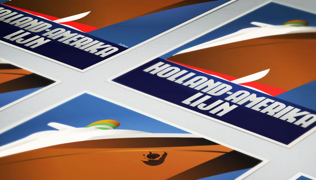
Since its foundation in 1901, the iconic Kop van Zuid building in the Rotterdam neighborhood has been shining. Where previously the Holland America Line was housed, you will now find Hotel New York, a building with a tremendous history. We’re glad to take you back in time with captivating memories.
In 1991, catering entrepreneurs Daan van der Have, Hans Loos, and Dorine de Vos refurbished the at-the-time vacant property into a hotel/restaurant. To honor its 25 years of existence, we’re celebrating this event with a brand-new font, “America Line,” a tribute to Wim ten Broek, the multi-talented Dutch Graphic Designer.
As early as the 1930s, before the Second World War, Wim ten Broek made the famous posters for the Holland-America Line. The influence of A.M. Cassandre herein is clearly recognizable. Wim ten Broek also worked for HAL with large surfaces and fixed lines in which primary colors dominate, accentuated with shadows acquired by spraying technique.
He also made graphic works for, among others, the World Exhibition in New York, the Dutch railway company “Werkspoor,” and the royal Dutch steel factory “Hoogovens.” His drawings and lettering gave me a love for the trade and naturally gave me a completely different view on fonts. That’s how I slowly but surely made my way to the trade.
Based on the letters I had at my disposal from the Holland-America Line poster, I started to complete the alphabet in the same style as the original text. I digitized everything in order to acquire a usable and modern font. The Holland America Line Font comes with uppercase and lowercase with all the needs of modern times to create a good digital font and to be able to use it for all graphic purposes. The font is ideal for headtext, posters, logos, etc. Don’t hesitate to use this unique historical font! It will give your work a certain glamor that you will find in few other fonts. Enjoy the Holland America Line.
The Holland America Line Font comes with uppercase, lowercase, numerals, and punctuation so you can use the Holland America Line font to customize all your designs. The Holland America Line font was designed by Coert De Decker in 2018 and published by Kustomtype Font Foundry.
The Holland America Line Font can be used for all graphic purposes. It is ideal for headtext, posters, logos, letterheads, apparel design, package design, label design, etc.
Don’t hesitate any longer and enjoy this unique historical font! It will give your work an elusive glamor, found only in a few fonts.
Enjoy your journey with the Holland America Line!
